Alumni

Aaliyah Sayed
Bio
Aaliyah Sayed is a rising junior at Princeton Day School in New Jersey. She loves technology and creative problem solving. She wants to become a tech entrepreneur and use AI to improve the lives of those around her. She is currently working on a project to connect teen coders with local businesses in need of websites. She loves playing field hockey, playing with her chickens, and hanging out with her friends.
Project: Classifying Stocks by Their Return "Fingerprints"
Goal
In the stock market, the returns (% change in price of the stock between days) of any particular stock create a fingerprint unique to that stock. For example, the returns of Tesla and Johnson & Johnson are very different since they are shaped by variable factors, such as industry, size and volatility. In this project, I used machine learning to analyze the "return fingerprint" of stocks in the S&P 500. Would the computer tell me that Facebook and Twitter are similar if I gave it no context? To isolate the return fingerprint from the rest of the variable factors, I trained the computer on pure DateListPlot datasets. I could analyze the impact of the variable factors, how people can use what they know about particular stocks to get a better overview of the market and the accuracy and precision of computer results. I aimed to correctly group stocks by fingerprint (within the time frame of a year) and analyze the correlation within the subgroups.
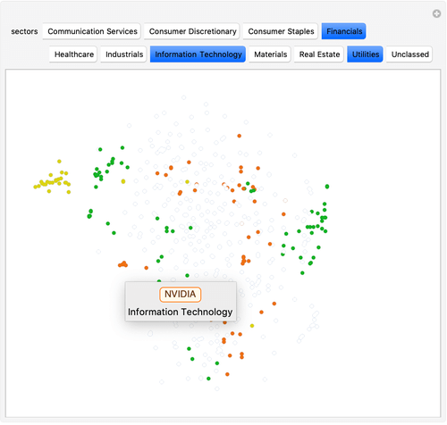
Summary of Results
The plot shows all of the stocks in the S&P 500. It appear like a burst of confetti at first glance, but a closer look reveals moderate correlation between the stocks. Dots of the same color cluster together into smaller subgroups, confirming that industry has a big influence on the similarity between stocks. In addition to this, dots of different colors sometimes cluster together. Upon further investigation, I found that these stocks almost always have something in common. For example, there is a cluster in the top right with both financial and IT stocks. Among these are VISA (financials) and Microsoft (IT), two big companies with low volatility that deal with online operations. This correlation is much easier to identify through visualization. In the second plot, I have selected the financials, information technology and utilities sectors. Again, one can see the correlation between sectors of various stocks. All of the yellow utility stocks cluster in the left, while the financial and IT sectors cluster in smaller subgroups all around the plot.
Future Work
I focused on the visualization of stocks by sector for a fixed time frame, but there are many ways to expand the scope and give more comprehensive results. One such extension is adjusting the size of the dots to indicate market capitalization. This would show additional correlation, as one would expect larger stocks to cluster together. Another extension is to create an adjustable time frame to see the market change over a period of time. This would be great to visualize the dynamic market, as well as to predict where the market is headed.